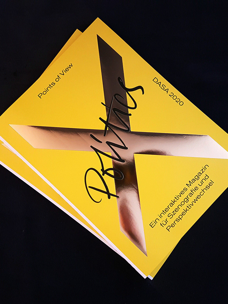
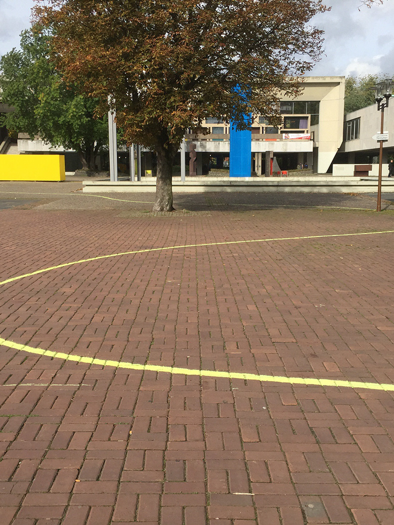
During their studies, the students of Fachhochschule Dortmund design faculty regularly travels for workshops in different countries to expand their knowledge. Every two years the results of their experiences forms an exhibition. We were given the task to curate, design, organise and promote this exhibition.
The original inspiration of the concept comes from our visit to the architecture biennial 2016 in Venice with Prof. Oliver Langbein and Prof. Lars Harmsen. The biennial was themed with the title ‘Reporting from the Front’ which is inspired by the archeologist Maria Reiche. While she was studying the Nazca lines in south America she was carrying a ladder with her to have a better view while not destroying anything. This tiresome and creative approach for her work was the core inspiration for the curators.
Therefore we also created this exhibition as reporting about students whom has gone great lengths to change their perspectives on design. The Student Report, Strep.
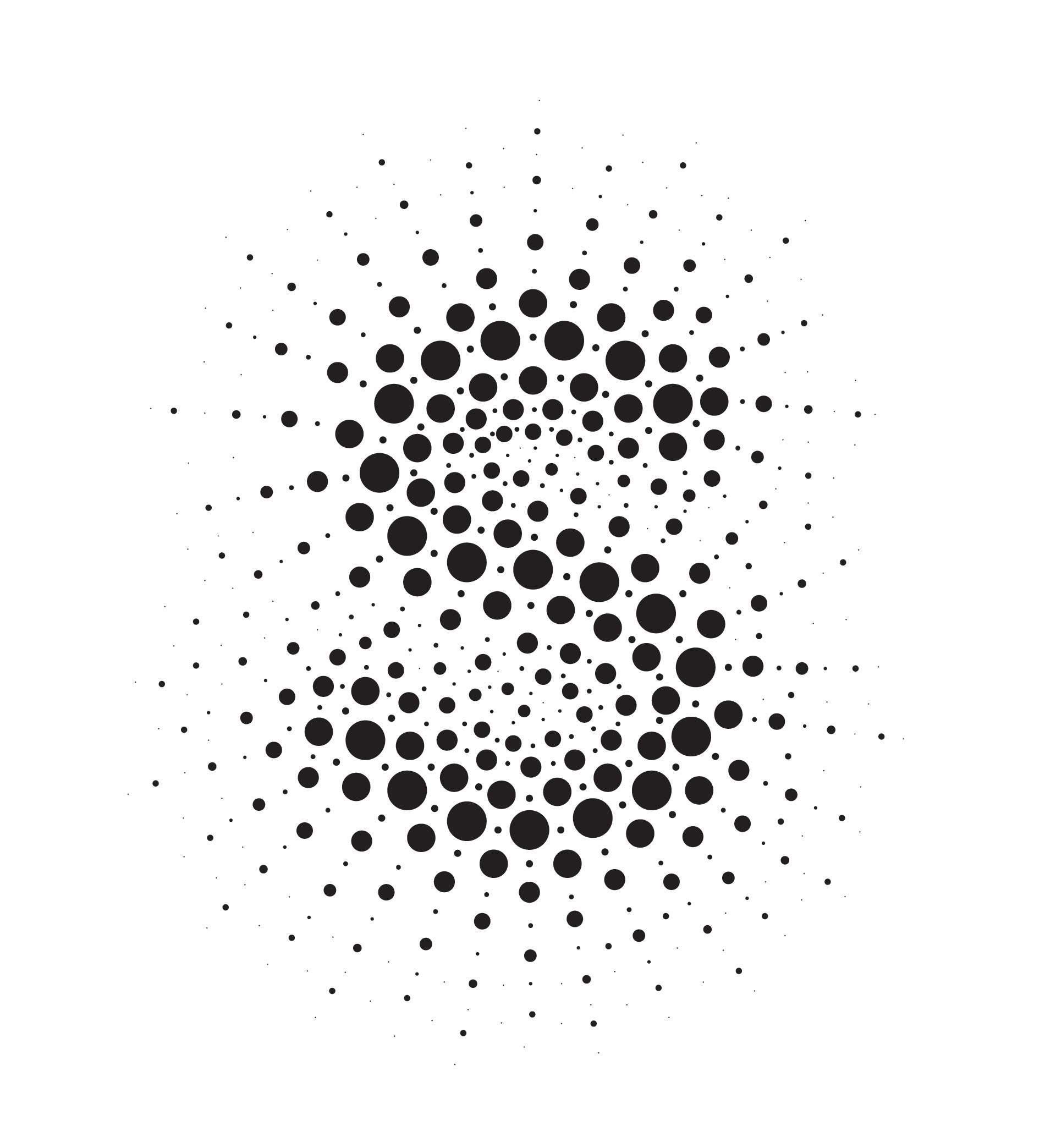

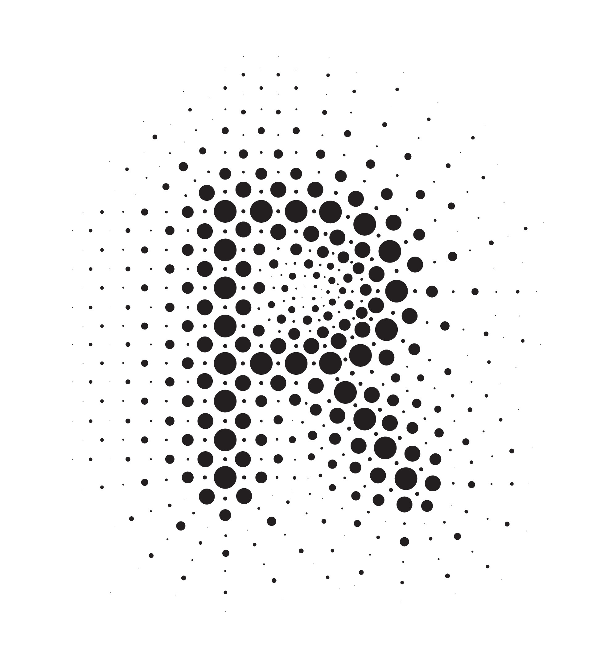

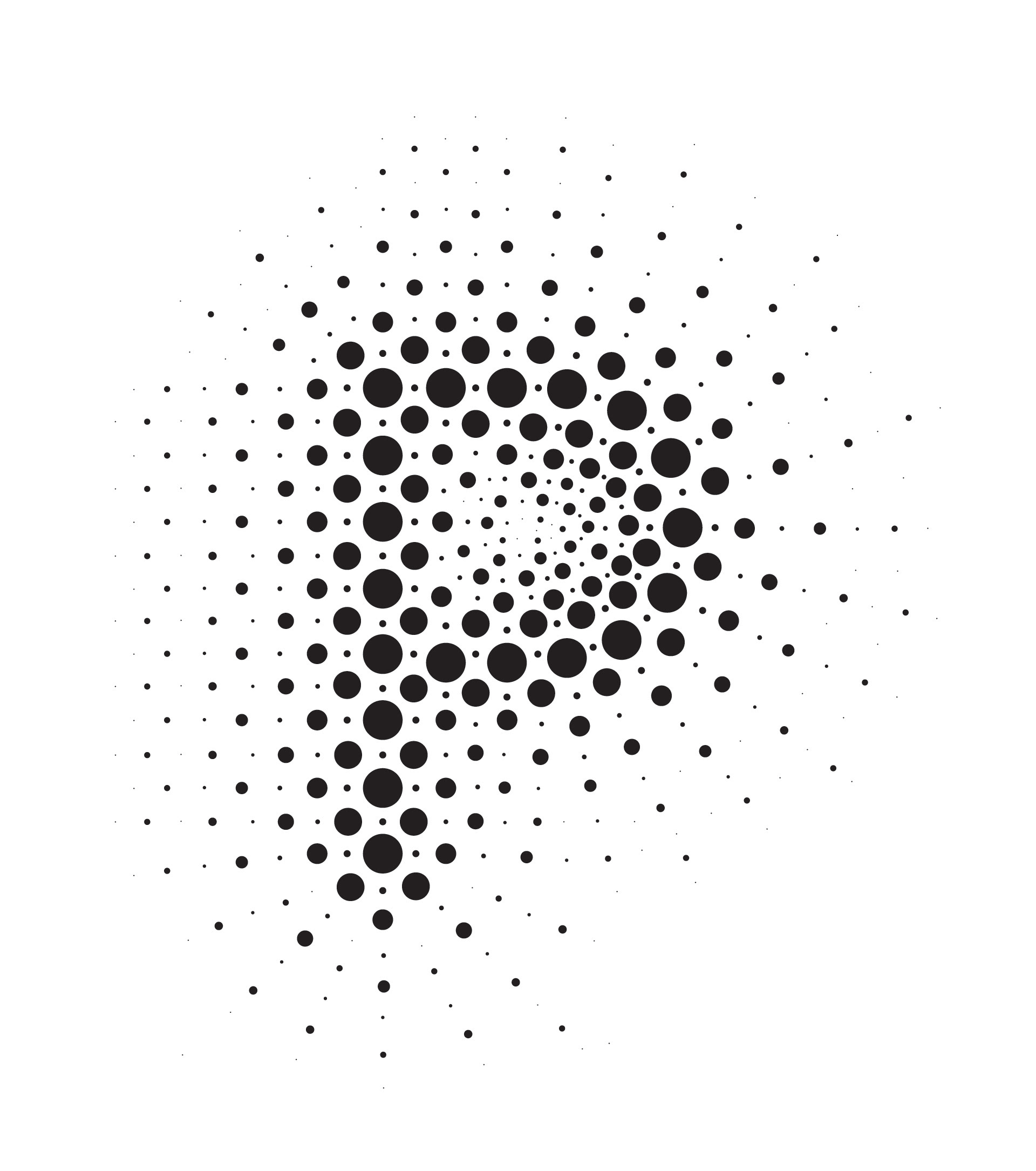
Lettering system design and execution: Ipek Ugurlu
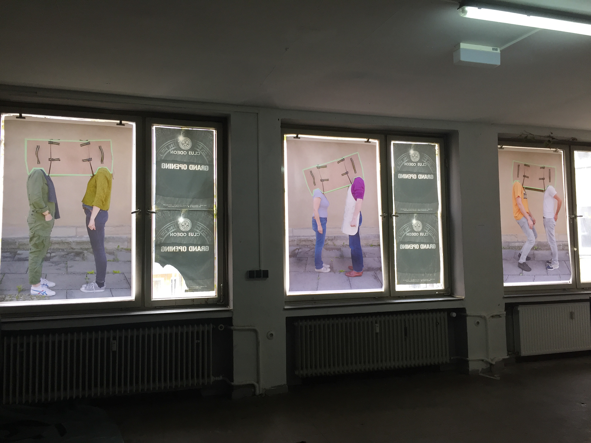
The combination of the two locations which started and ended this project is used in the visual language. The bright waves surrounds Venice and the past glory of an old disco in Dortmund. The system to create this vision is similar to Almir da Silva Mavignier's dot paintings from 50's which was also a subject to a course for one group of design students of the past semester. In the meantime the photos created in different countries by students played as the background for the poster series.
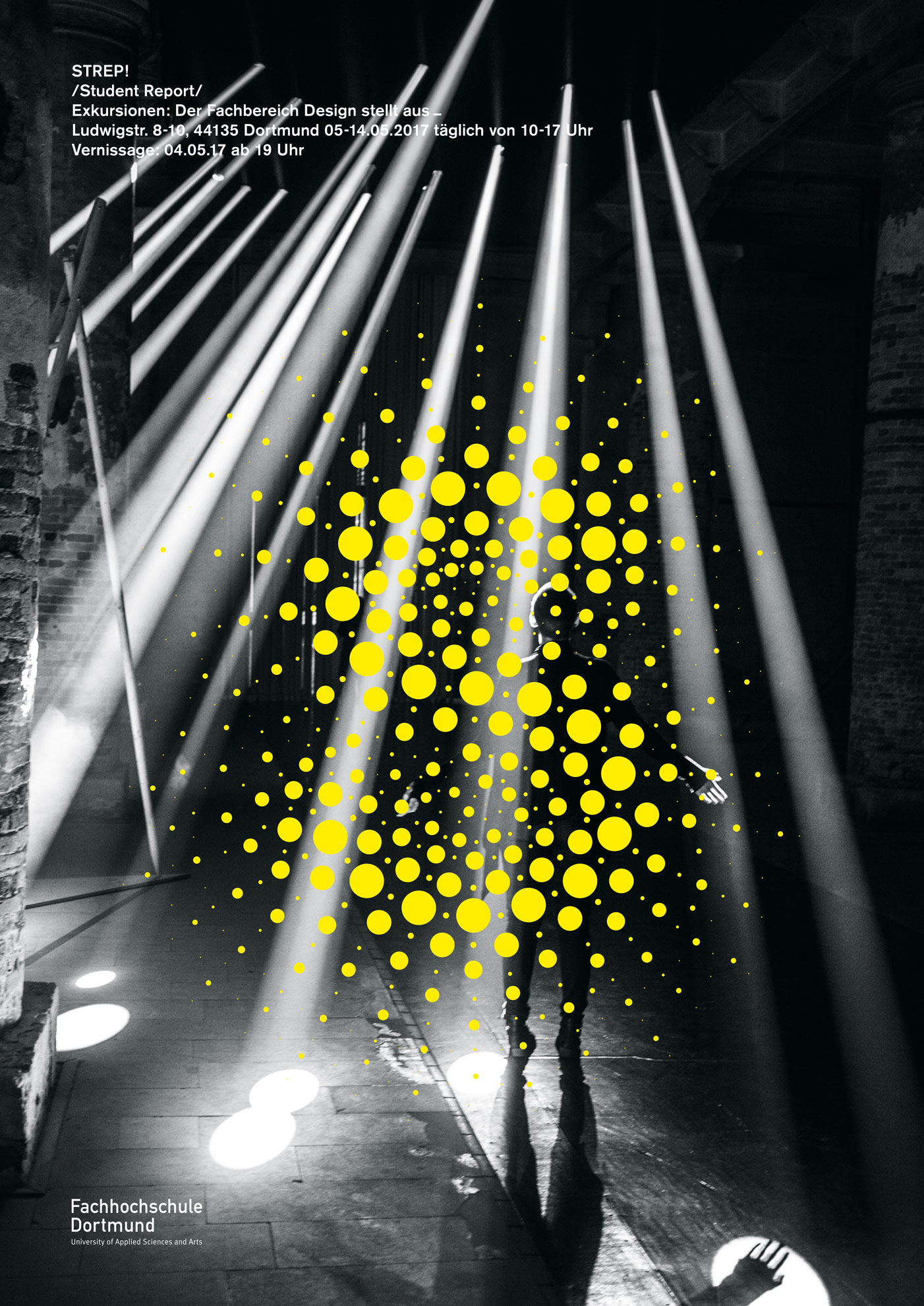
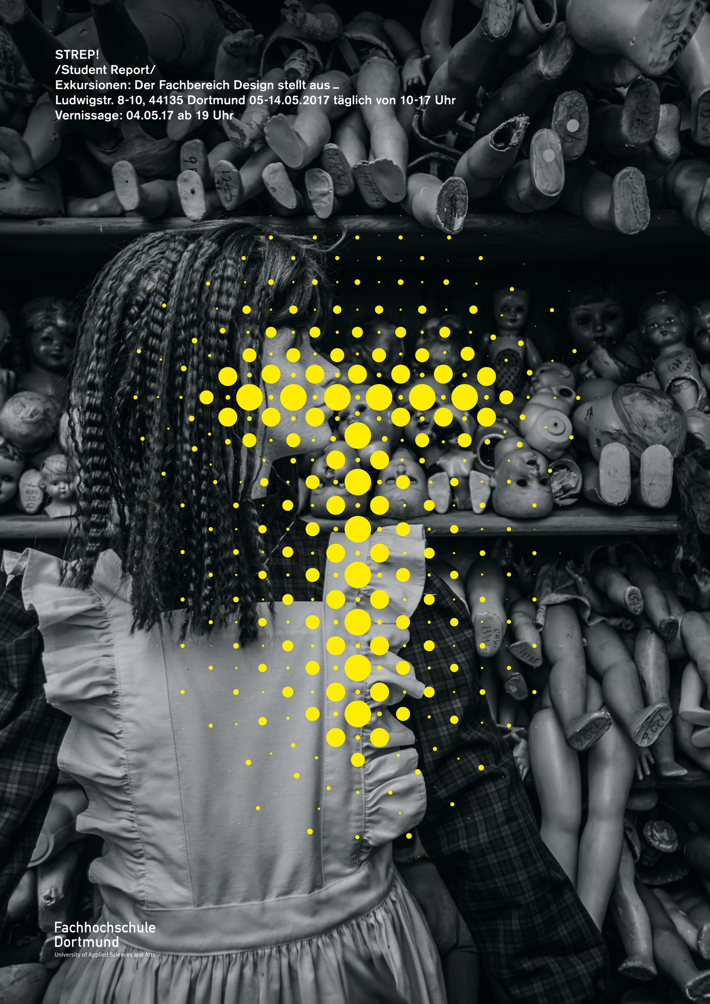
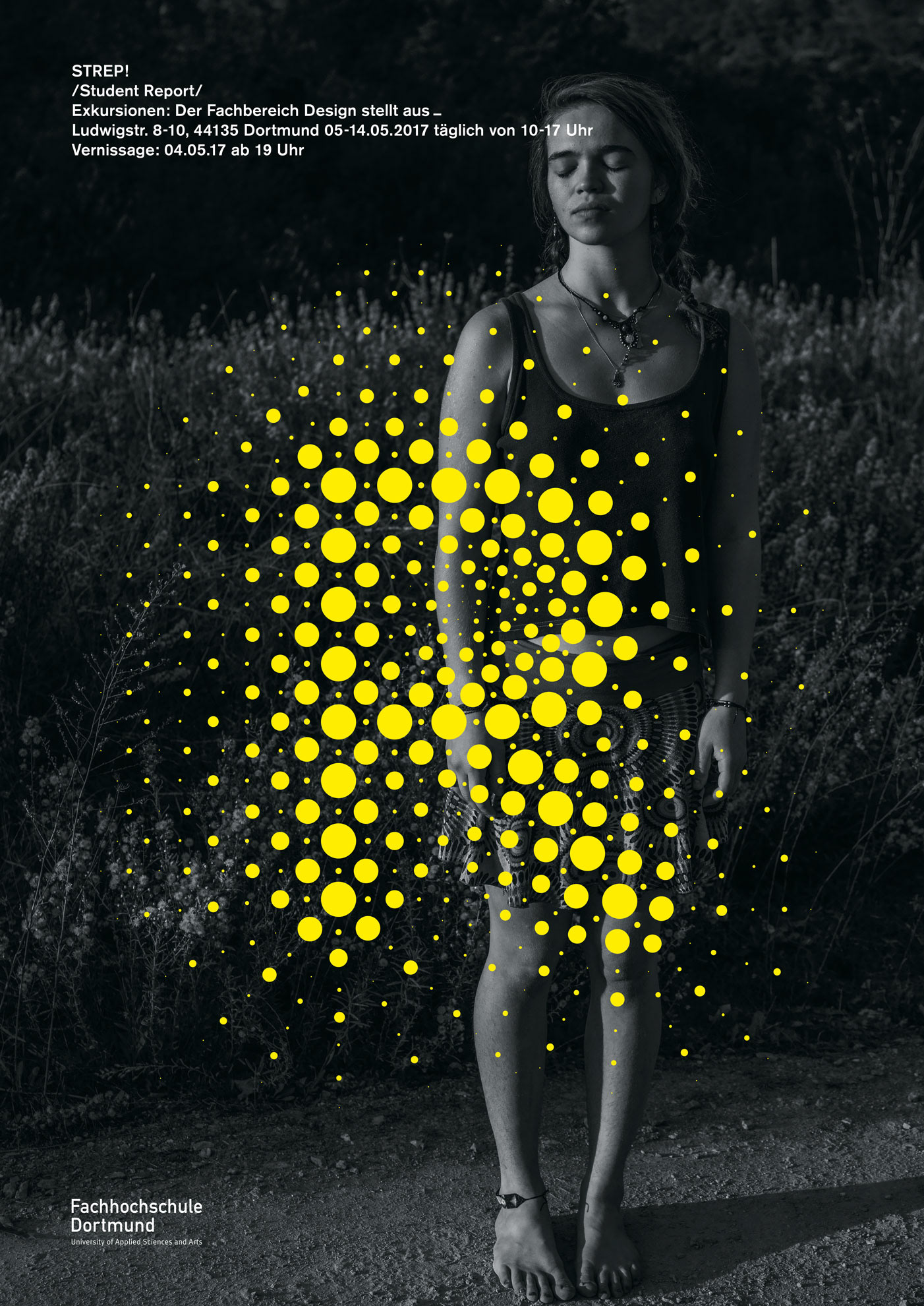
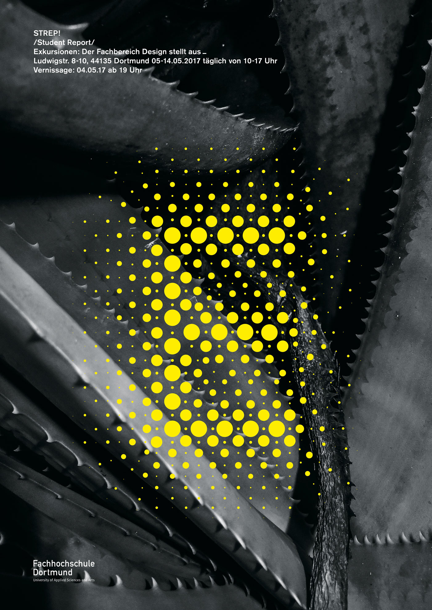
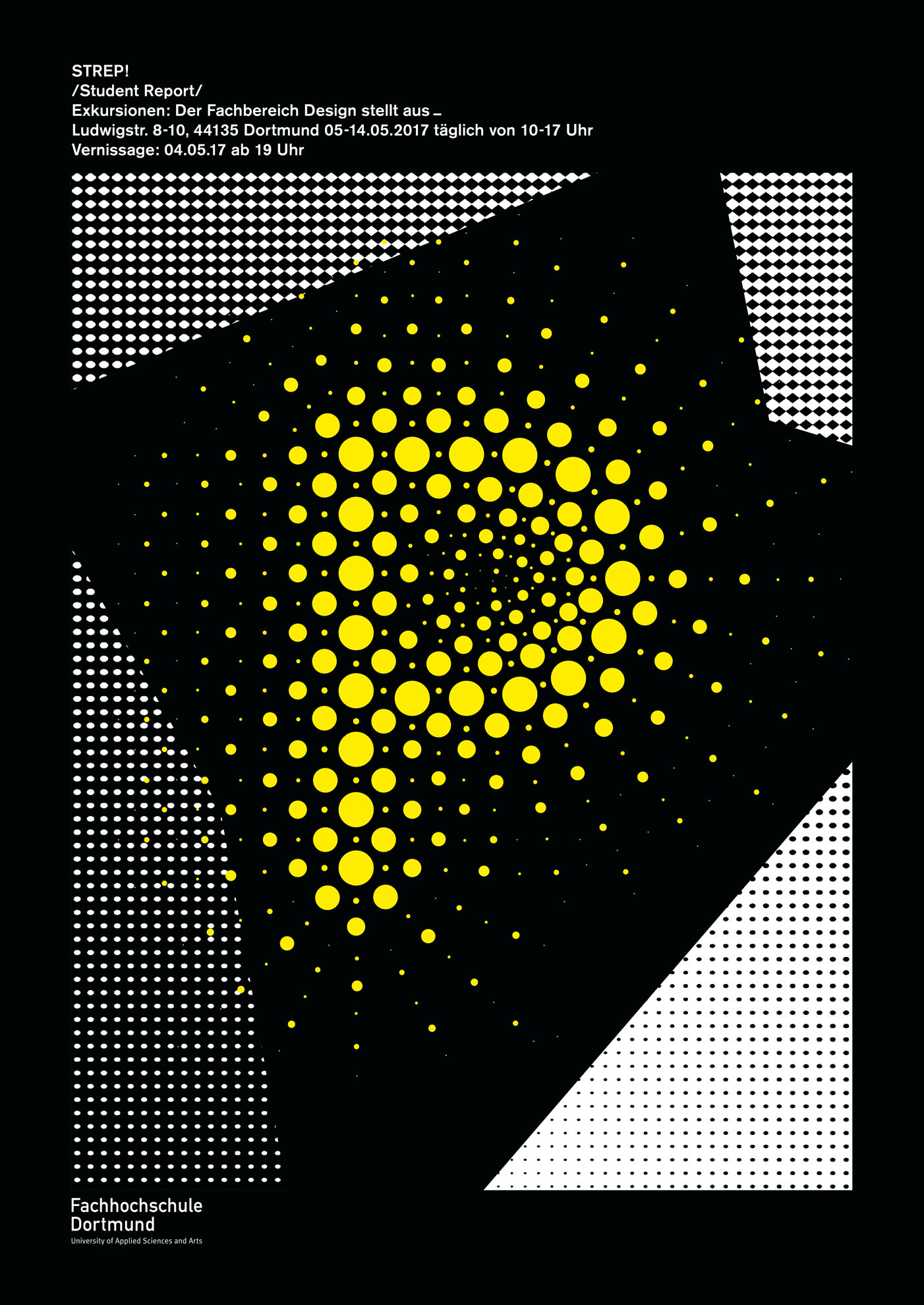
Photos used for poster as a background: S: Lars Harmsen, T: Jennifer Bergsiek & Carlos Krug, R: Fabian Ritter, E: Kristina Lenz, P: Andre Mueller
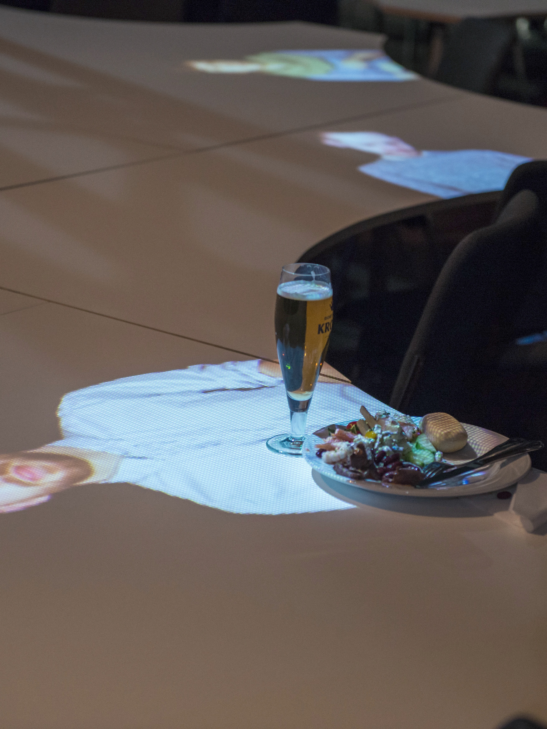
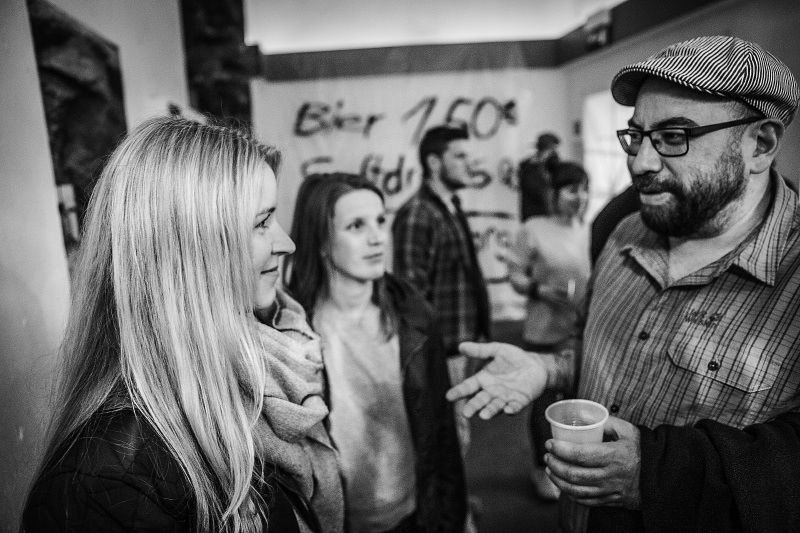
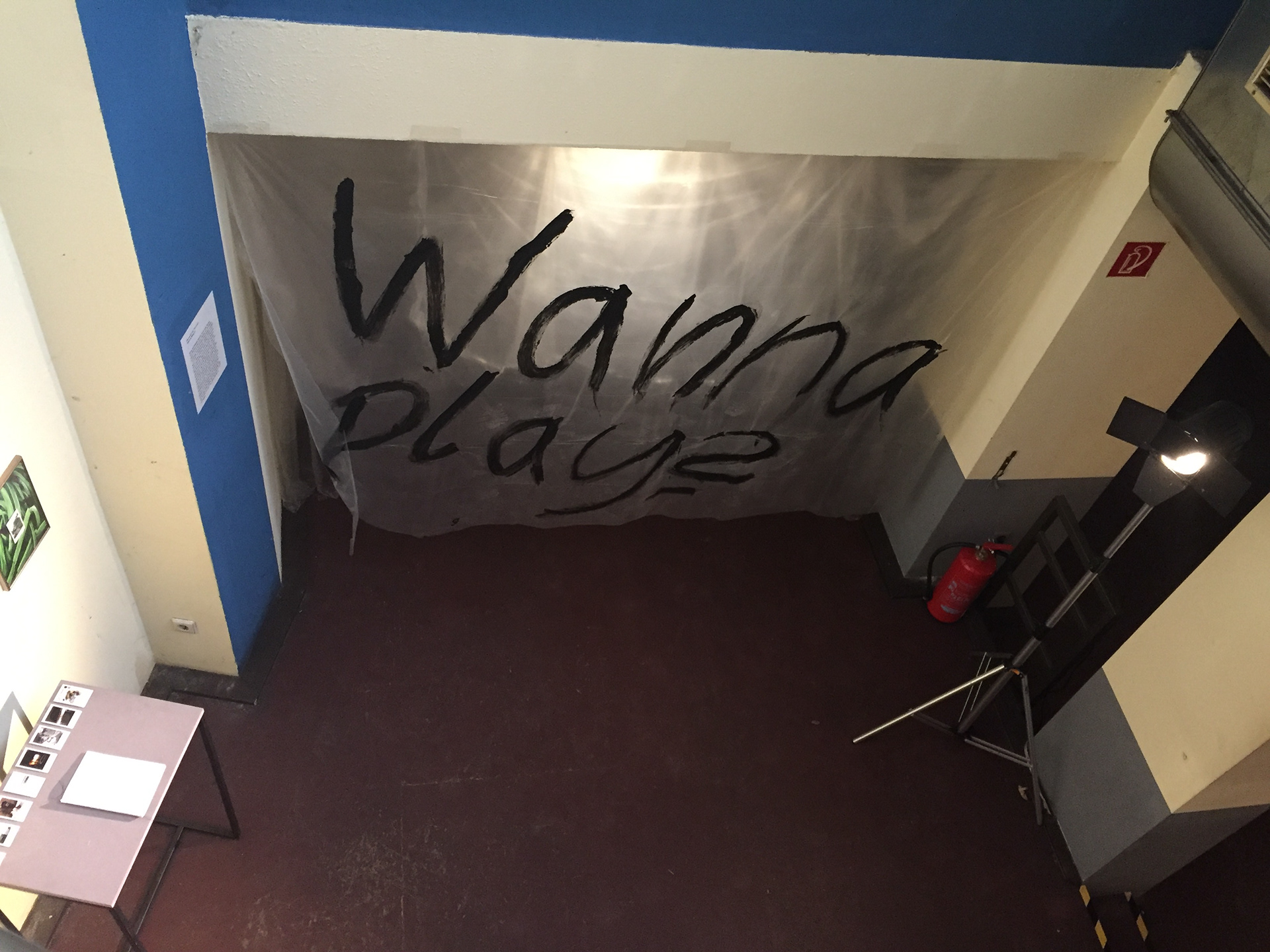
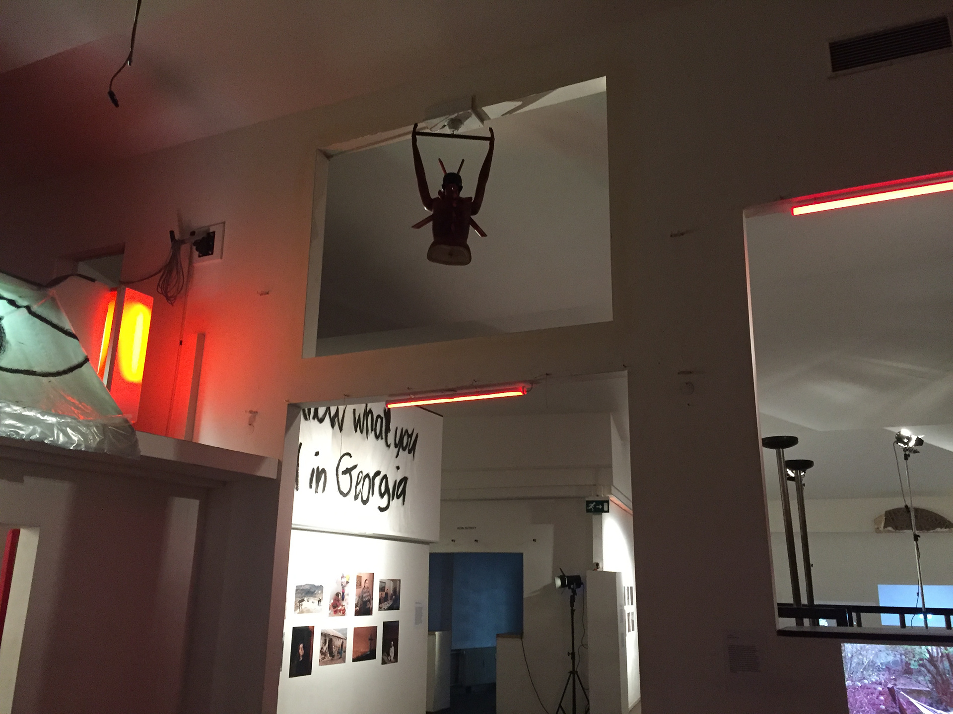
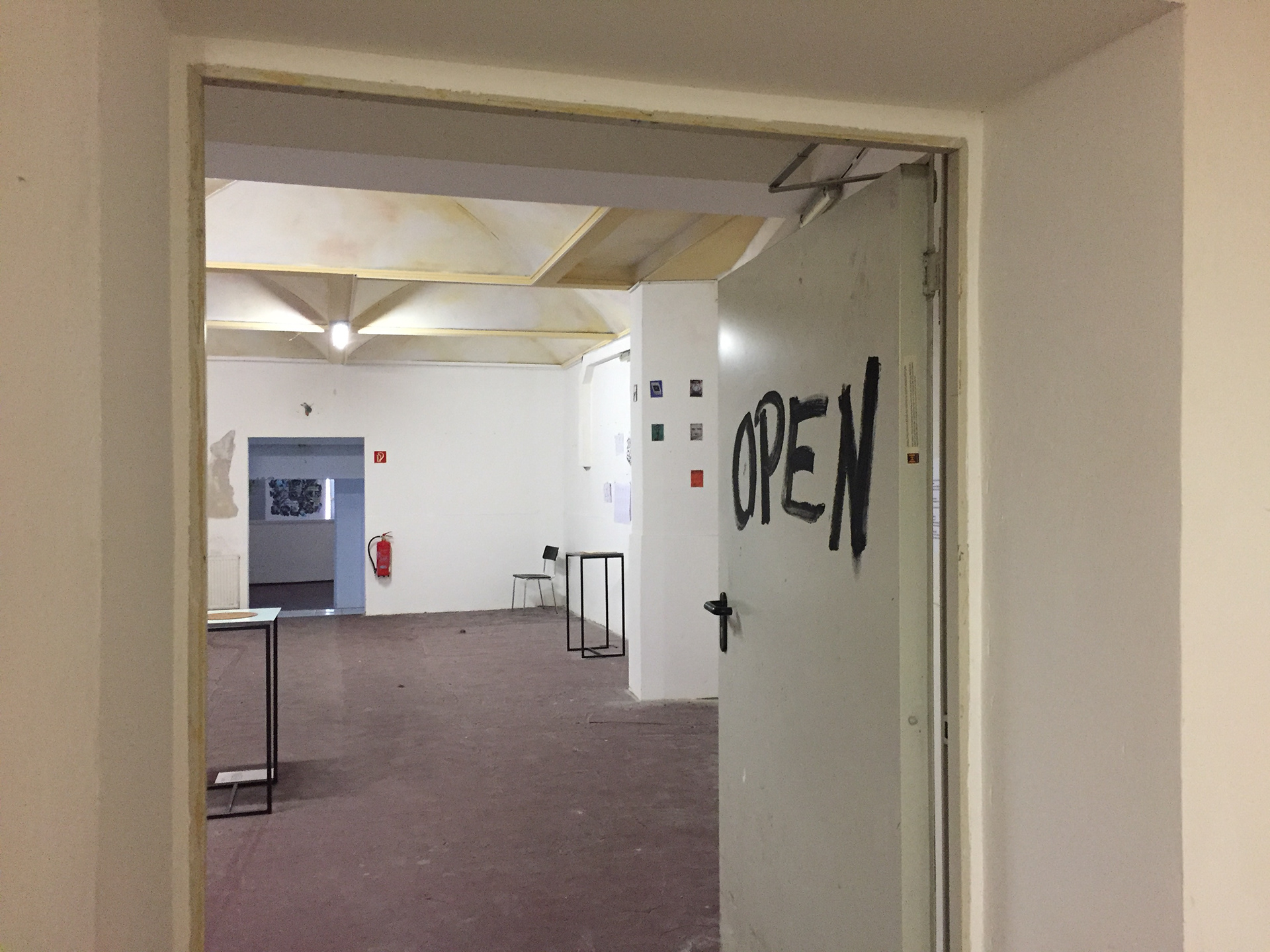
Location for the exhibition was an unused venue which used to be a disco called Odeon. The venue without it's old glory and lights looked dirty and dangerous. But it was actually a good innocent space, enough to display many art and design products and hold an opening party. The venue was like our name Strep, in first hearing it sounds something dirty but actually really meaningful and has a story. Therefore the design of the scenes to fit this atmosphere for the exhibition created as if it was a crime scene and the signs which was supposed to deliver important information about the work, talked to the visitors as if it knew something secretive about them.
The material solution that we come up with to make this vision had to be easy to remove so the place can be rented afterwards faster and we also needed find a budget friendly solution because of the big two floor space and the information we had to spread all over. So we took basic transparent plastic sheets people often use in rainy days in Venice because of the rising sea. This kind of sheets also commonly used in popular culture to reference serial killers. Therefore the combination of this cheap plastic, black paint and the light design created the mysterious atmosphere that we wanted to reach.
We were in every stage responsible for this project. Besides designing and creating the concept, our tasks included; producing and spreading our posters and flyers all over the city and nearby cities, taking care of the social media and communication, meetings with fire department to keep up with the safety regulations, organising the opening party, setting up a bar and refilling the bar with staff and drinks, registering for the original music that is going to be played by the dj at the opening night, organising the lights to brighten the huge venue or even arranging alternatives for the toilets since the venue didn't have functional ones. We were happy to have answered all the problems this project needed and manage to enjoy our magical opening party with around 200 people. and have reached around 500 people during the two week exhibition time.

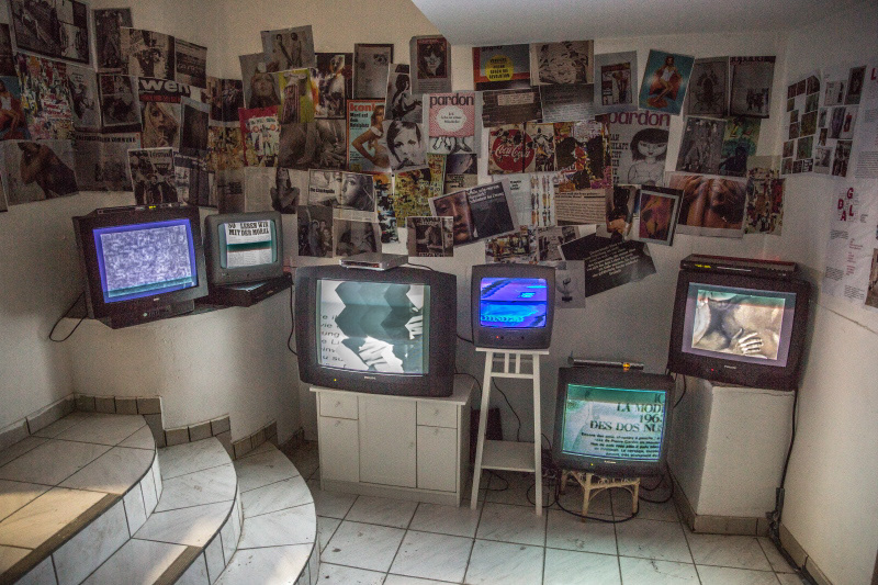
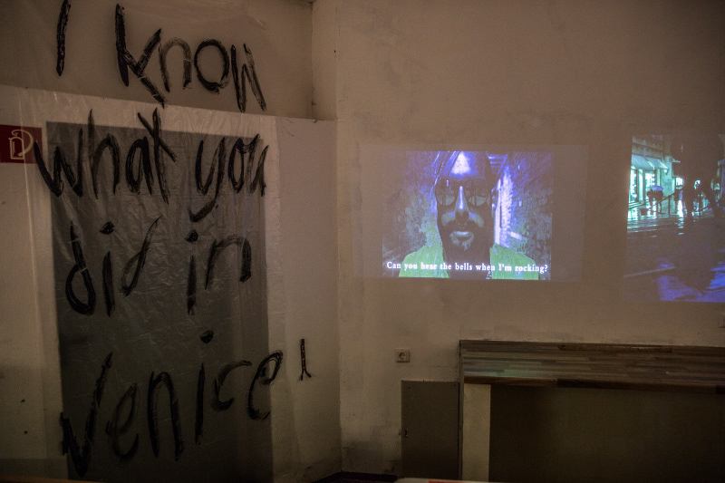
Team: Ipek Ugurlu, Betül Göksu, Insa Termöhlen, Leonie Didszun, Monica Seidel
Supervised by Prof. Oliver Langbein and Prof. Lars Harmsen
Thanks to Dj Tim Kleimeyer, Terrania AG Dortmund, Fh Dortmund Asta and neighbour restaurants for the collaboration.

